WebMD App - Creating an on-brand, focused experience
WebMD provides consumers with the latest news, drugs, health, and wellness information. It also offers several tools to help users manage their health such as the Symptom Checker, Doctor Directory Guide, Drug Savings Program, and Medication Reminders.
Overview
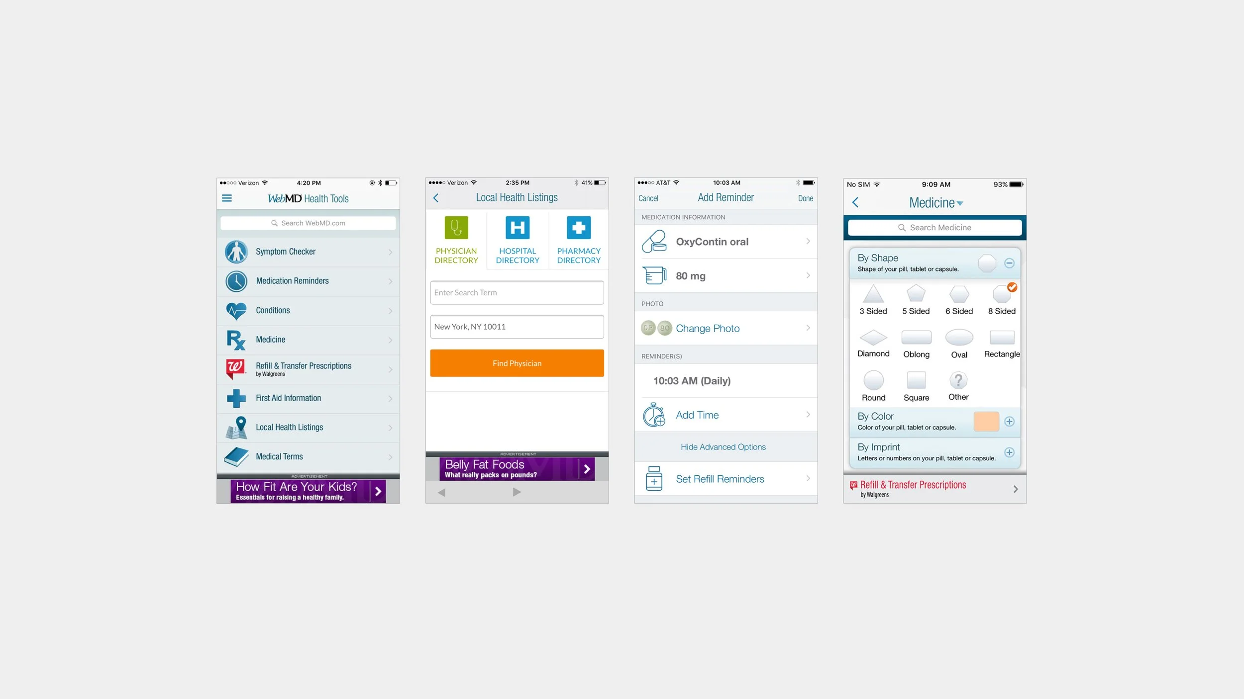
When I first joined the WebMD product team its flagship WebMD app was filled with web views and every tool offered on the website. The home screen became a toolbox of services that didn’t connect to each other. It lacked focus and created a situation where most users only opened the app 2-3 times a year during cold and flu season to check their symptoms, conditions, or drugs.
Goals
Create a more meaningful experience that connects the tools and services WebMD offers.
Create an environment that encourages repeat usage of the app.
Improve the UI and UX to be more user-friendly.
Year
2017 - 2019
Tools Used
Sketch, Invision, Zeplin, Principle, Marvel
Role
Lead Designer
included working with Product Managers, UX Researchers, Stakeholders, and Developers to ideate ways to improve the WebMD app. I created wireframes and prototypes to test based on our design sprint sessions. Once testing was complete, I translated all feedback and wireframes into high-fidelity mocks. I also worked closely with the development team to define all app interactions and animations, and to create design components and style guides to support future design and development.
The Process
Gather Info
I met with Product Managers to collect data on app traffic and usage in each section of the app. Working with our User Researcher we gathered and synthesized info on the current user base and challenges faced by conducting testing on the older version of the app. While also meeting with business stakeholders to narrow down requirements such as ad placements and revenue opportunities.
Design Sprint
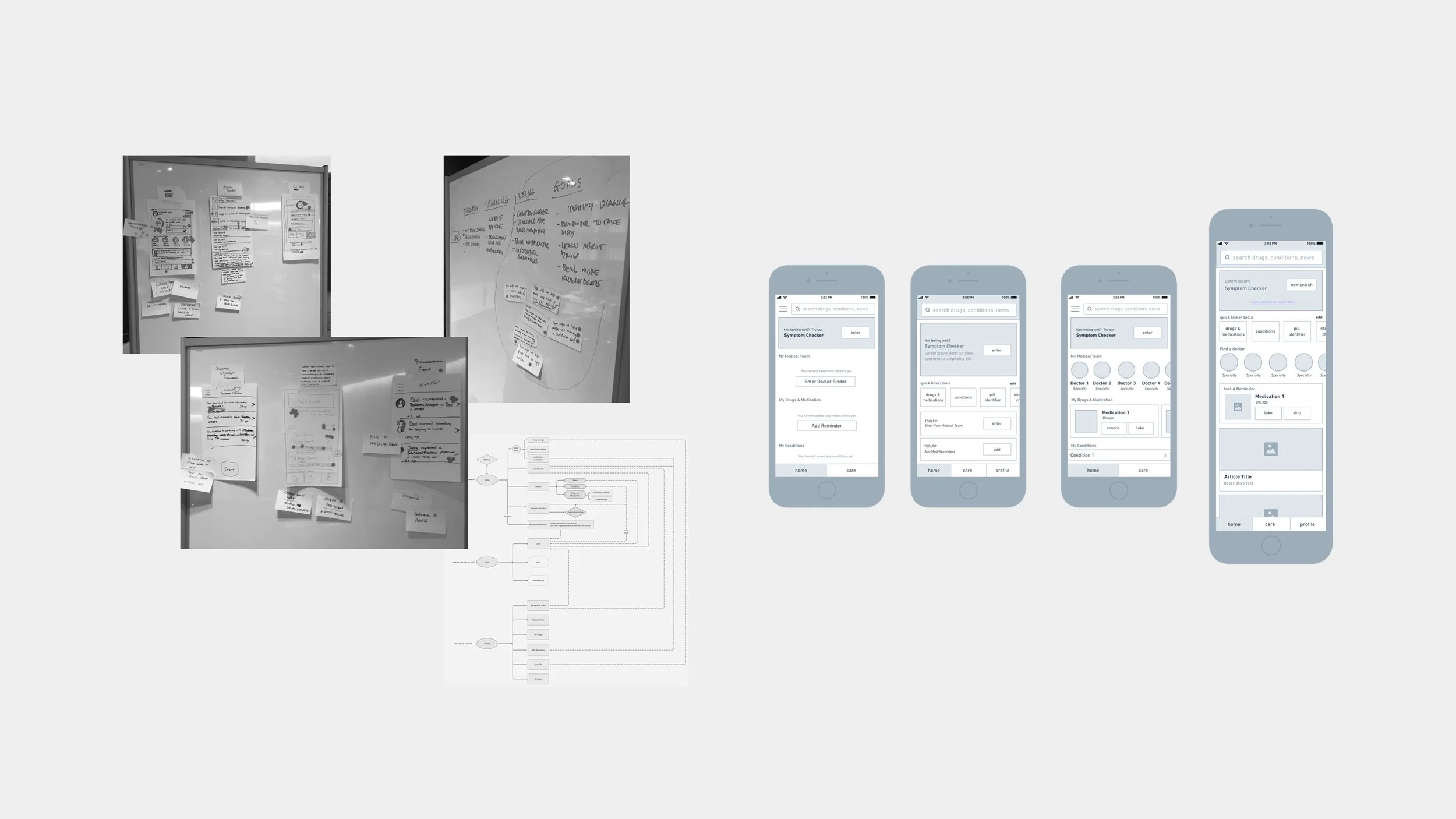
3-day design sprint which included myself, UX Researchers, Product Managers, and Development Leads. The goal was to ideate around “how might we create a more valuable app experience” based on the business requirements, usage data, and feedback gathered. We found that the WebMD Symptom Checker would be essential in tying the experience together for our users and it would be the starting point in the journey to using our other tools.
Test
After ideating on “how might we leverage Symptom Checker to create a more valuable app experience,” I created wireframes illustrating multiple concepts that emerged from our design sprint. Our User Researcher then tested the concepts with users who either used the app in the past 3 months or had it downloaded on their phones. After testing, I decided to flesh out our leading concept some more. After multiple rounds of testing the leading concept, we received feedback that it was to the point, easier to use, attractive, and well organized.
Design Strategy
Symptom Checker is the most valuable in-app tool that our users rely on to self-diagnose and quickly look up information
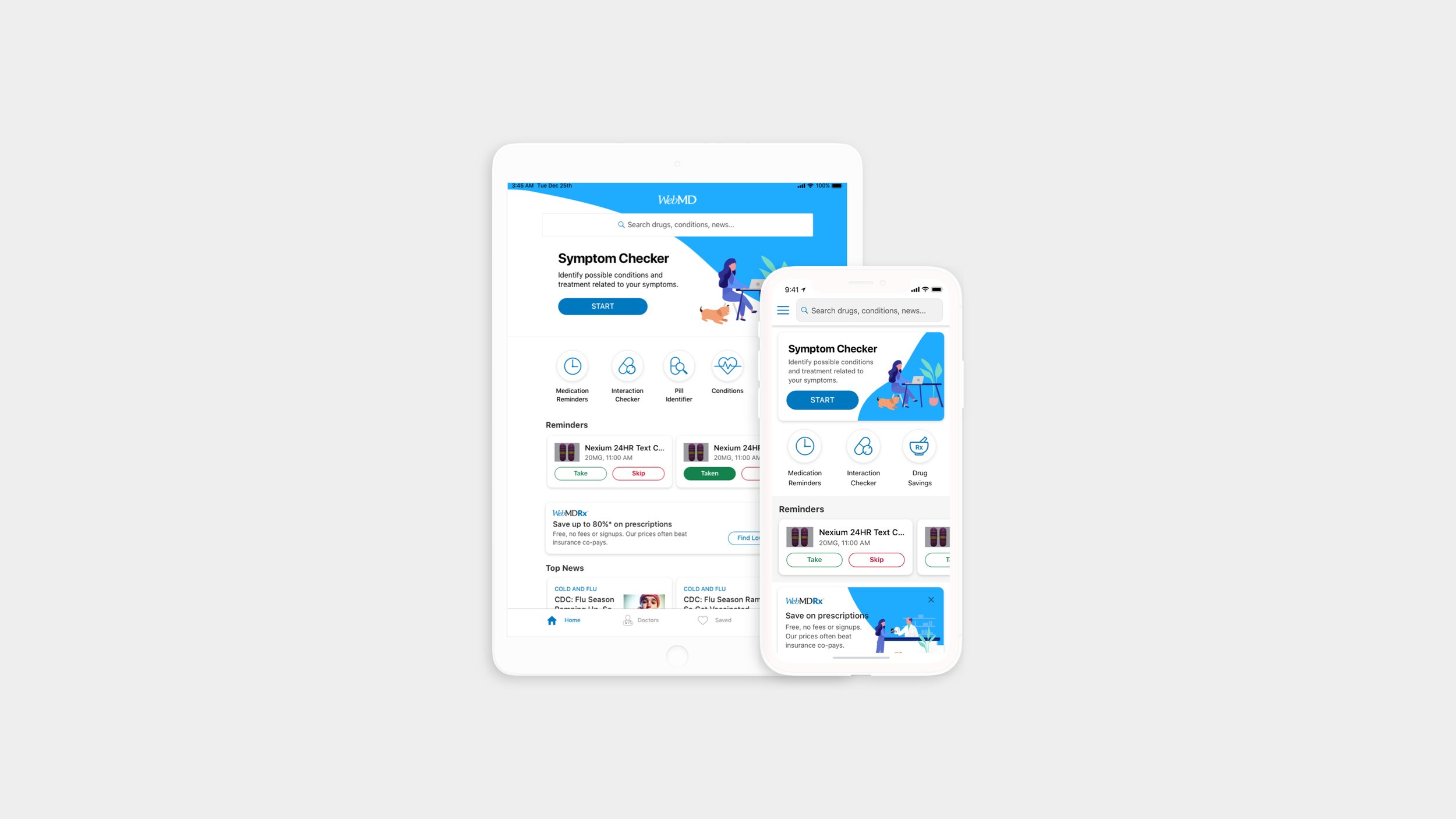
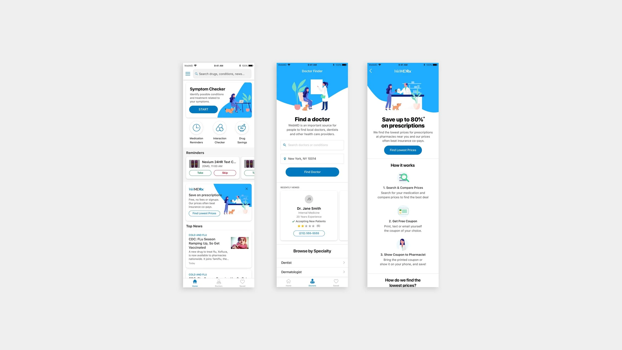
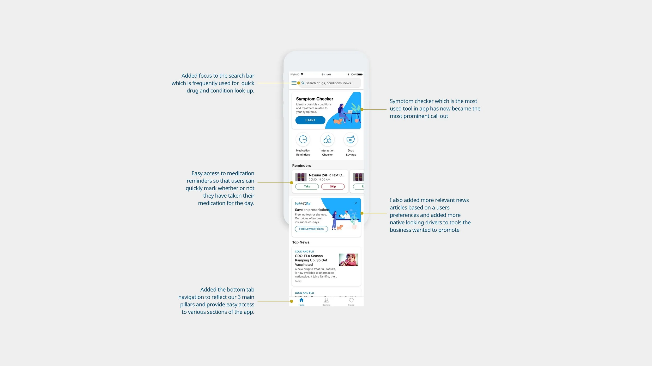
I designed the symptom checker tool to be the most prominent component on the homepage. Our usage data and interviews showed it is the most used tool in the application and the only tool which can connect to the app’s other hubs of information. Since Symptom Checker is the starting point we also added additional drivers at the end of the experience that would lead to our other tools and resources.
Updating the app interface to create trust in the brand and information
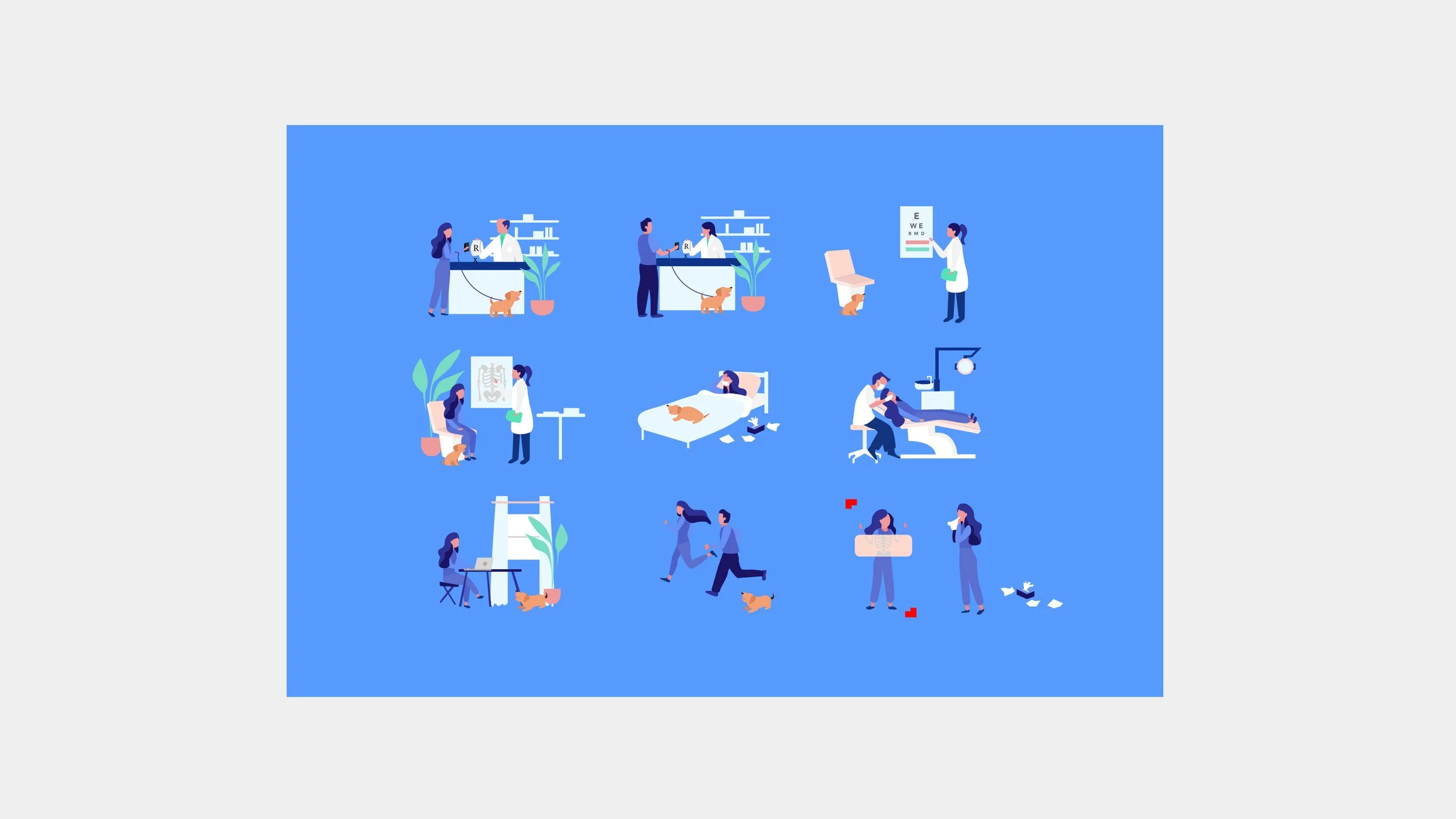
We often got feedback that the app is dated and lacked design. In an effort to solve for this I created a design system for consistency throughout the app which is in line with the larger WebMD brand. I also attempted to add delight by creating a series of illustrations that would follow the user throughout the experience and act as a guide through each section. It would make the app feel more welcoming and friendly. In addition, the design system would make future development and design more efficient which was a concern for the team.
Reorganizing the content to make it easy to digest and use.
I added a bottom tab navigation to reflect our 3 main pillars and provide easy access and focus to various sections of the app. I also added focus to the search bar which is frequently used for quick drug and conditions look-up. For our daily users, medication reminders will appear so they can quickly check whether or not they have taken their medications on app launch. Lastly, relevant news articles based on a user’s preferences would round out the homepage with native drivers to tools the business wanted to promote.
The Results
At the launch of the redesign we saw an increase in our traffic not only to Symptom Checker but to other sections of the app. The app experience also became consistent across iOS, Android and iPad. The creation of a style guide and components will allow for faster development and iteration in the future. This redesign also created a good base for future personalization goals on our roadmap.
After the launch of this redesign I worked with the Product Managers on a weekly basis to A/B test components in an effort to optimize the app experience.