Medscape App - Creating a go-to destination for health care professionals
Medscape provides access to medical information, news, continued medical education (CME), and various tools for physicians, nurses, and medical students.
Overview
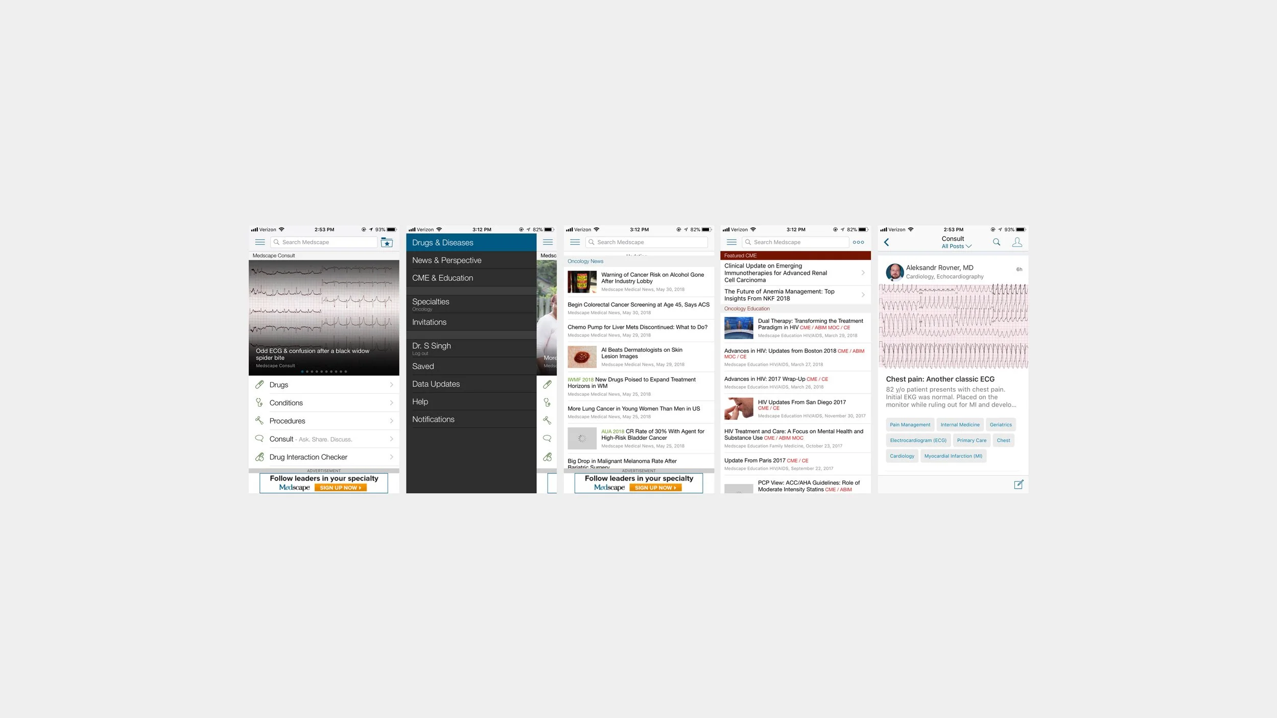
The current Medscape app offers all of the content one would find on the desktop site but most of this content is currently buried and or hidden in the app navigation.
There is also a stand-alone Continuing Medical Education (CME) and news app (Medpulse) which both have very low traffic in comparison to the Medscape app. With this redesign, the plan is to integrate these apps into the flagship Medscape app so that it becomes a hub for all HCP needs.
Year
2018 - 2020
Role
Lead Designer - As lead designer, I was tasked with rethinking and redesigning the Medscape app. The team included Product Managers, UX Researchers, App Development teams, and various business stakeholders. All of whom I worked very closely to create the best experience for our users while also meeting the project goals and business requirements.
Tools Used
Sketch, Invision, Zeplin, Principle
Goals
Bring visibility to hidden tools, content and services while keeping the most important and valued features prominent.
Create a cohesive look and feel throughout the app (and across iOS and Android) with the creation of a component library and style guide
The Process
Research
This required meeting with all of the business stakeholders to gather information on expectations and goals. Our user research team also conducted phone interviews with many physicians to collect qualitative data on how physicians currently use the app and what features would be useful to them. This combined with quantitative data on current usage I found that most physicians are happy with the current reference focus of the app but they would like to see more important industry updates and news related to their specialty. Most of which the app already included but it was hidden in the hamburger navigation.
Prototype
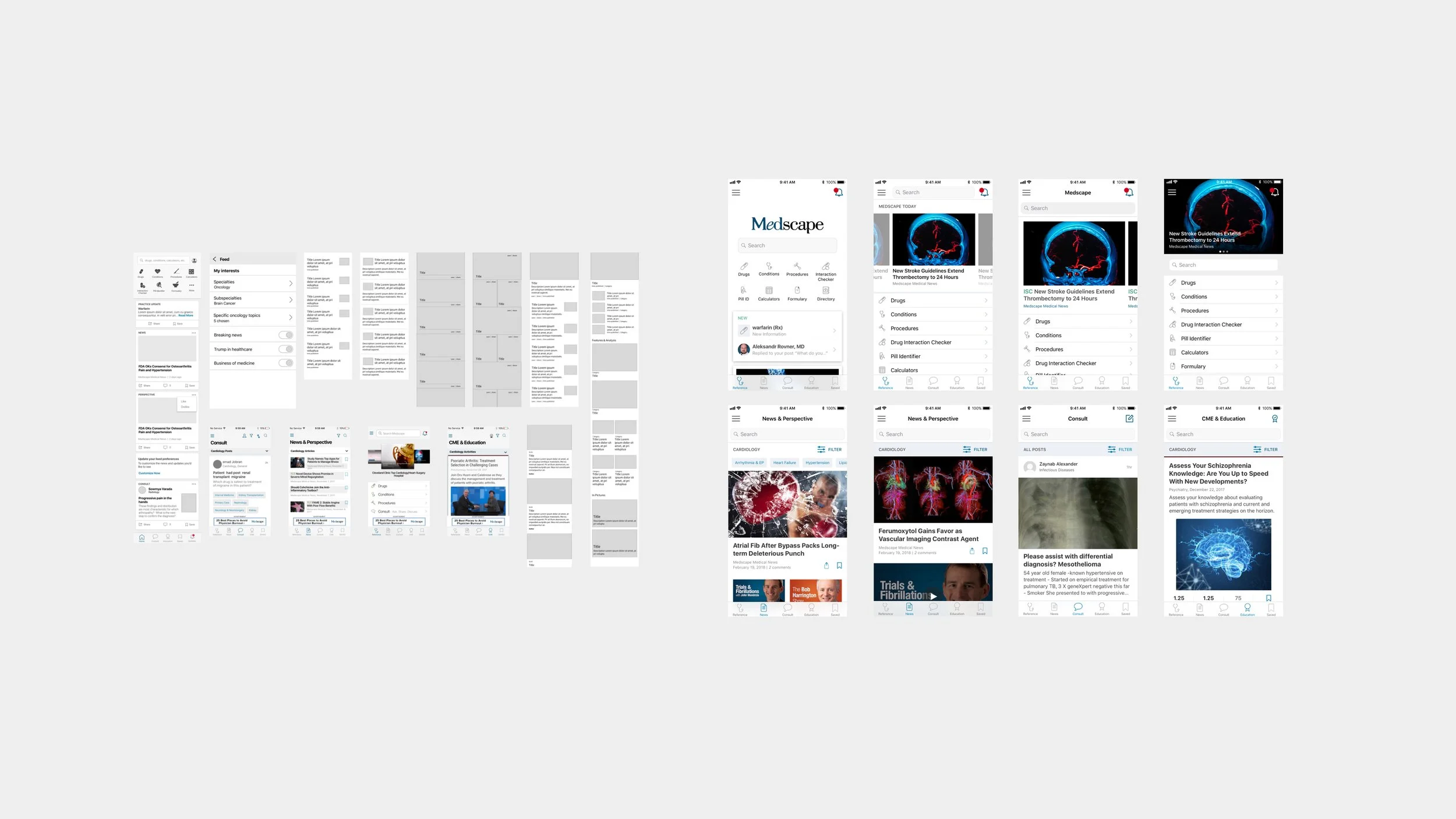
Working with our user researcher we ideated around “how might we make Medscape a hub for all HCPs needs” After several wireframing sessions I created prototypes for our physician interviews and user testing.
Design, test, refine, iterate
Based on the wireframes and testing I built prototypes and high-fidelity mocks to bring our solutions to life. I was in charge of presenting these to product managers and various stakeholders. I also worked closely with development to confirm all interactions and the best solutions for implementations.
Design Strategy
Personalize the home feed based on a users needs
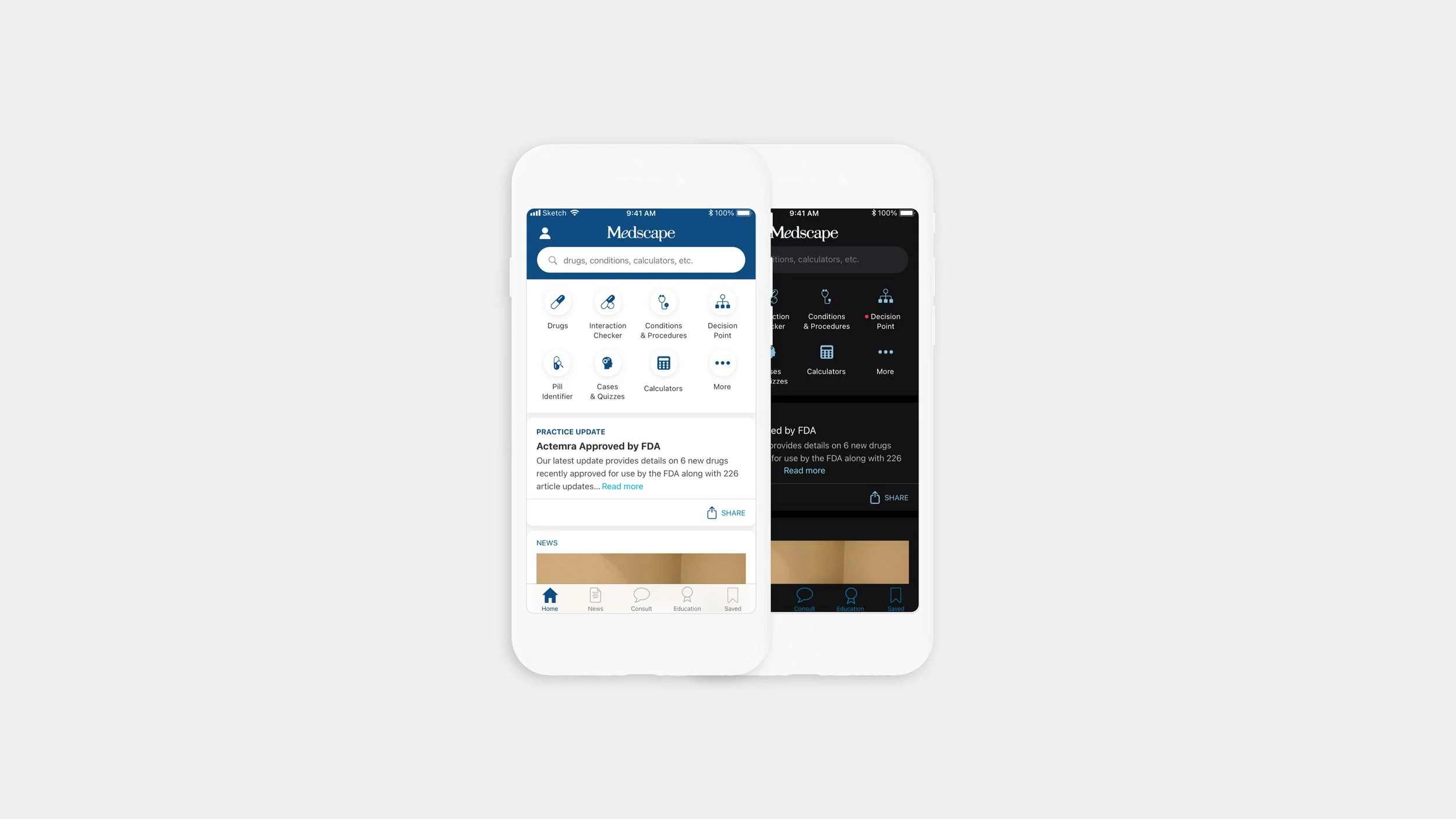
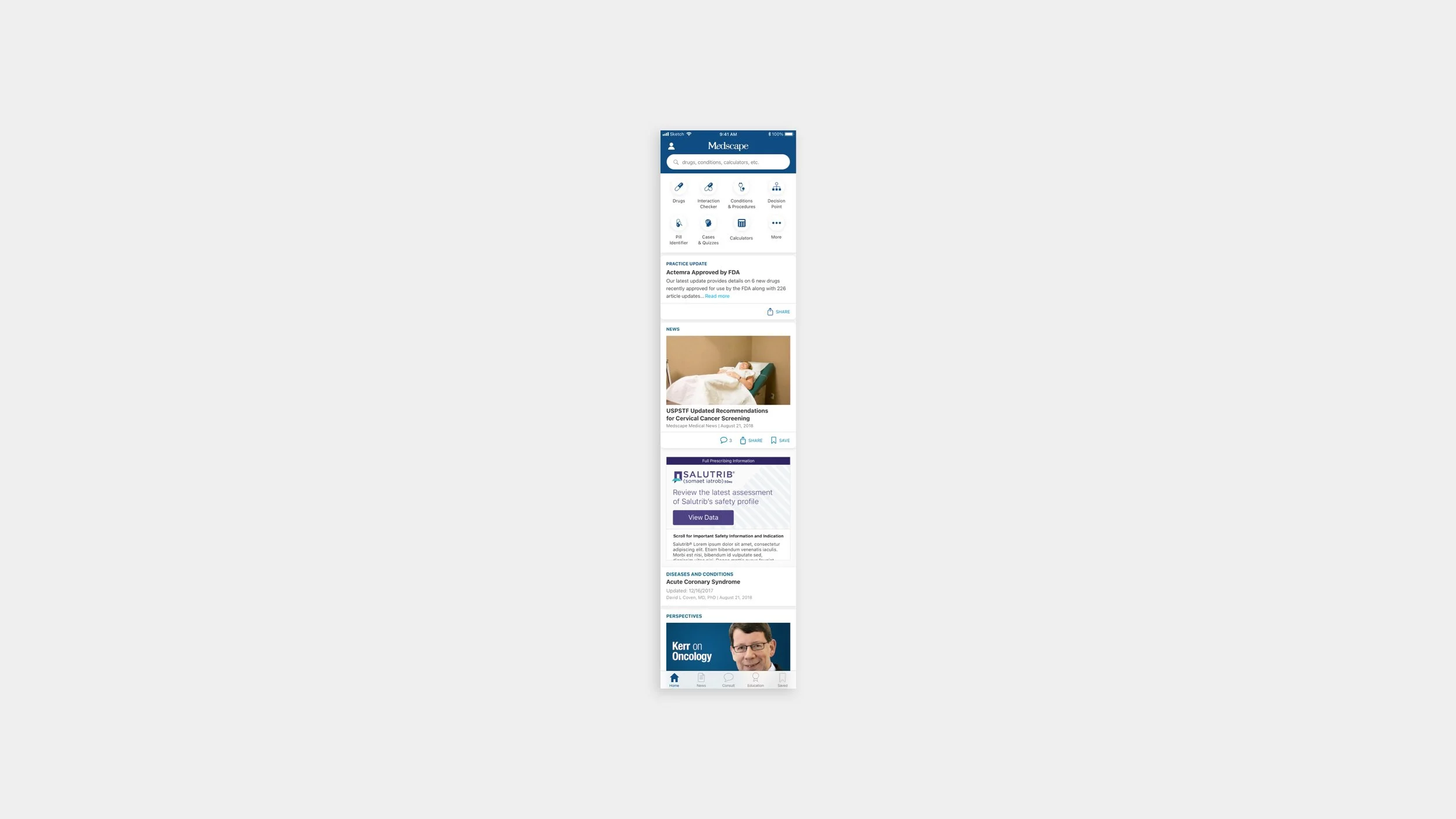
The new home screen redesign solves a few problems. First, it brings prominence to the search function which based on data is the most used feature across the app and website, and based on our interviews we found that it is the go-to section during the point of care.
The added bar of reference tools gives physicians easy access to calculators, directories, and more features which they can also customize based on their specific needs.
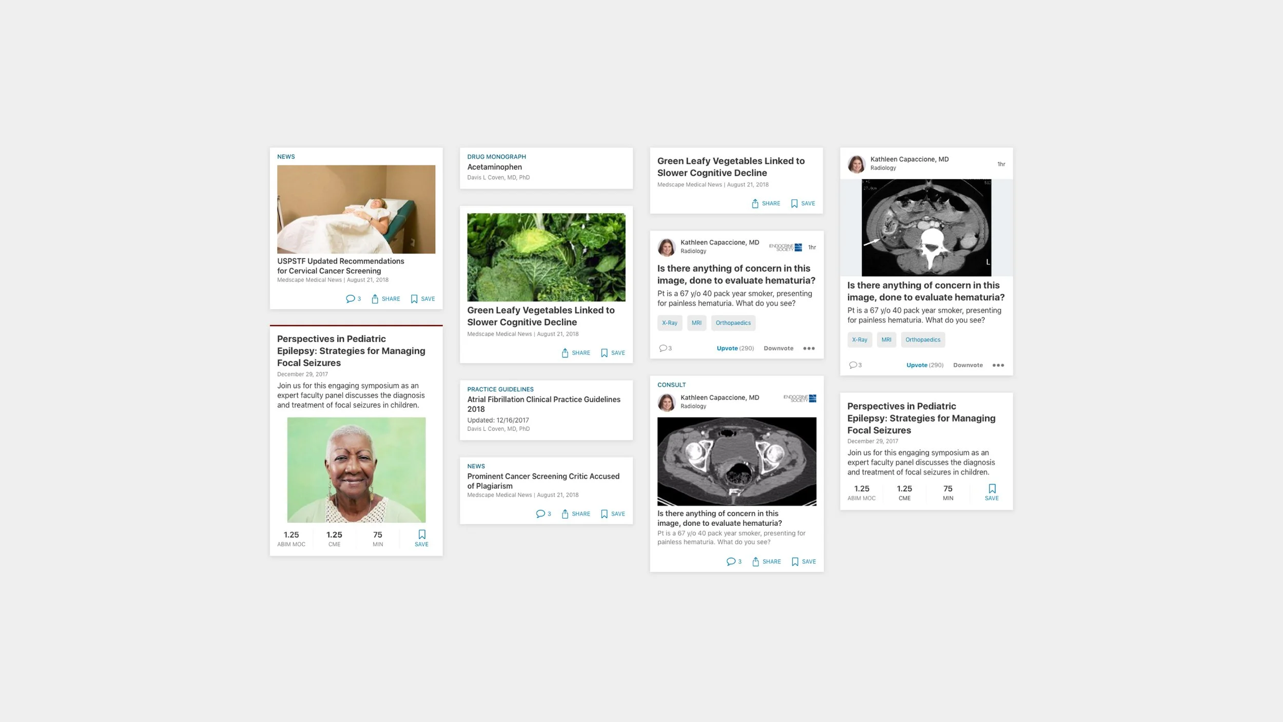
I also added a feed to surface updates on drugs, guidelines, news, and reference material based on a users specialty and preferences. Physicians expressed a need for this curated feed since they often received newsletters filled with articles that weren’t relevant to their specialty. In addition to this, the feed also satisfied a business need for more integrated ads and promo experiences.
Lastly, the added tab bar/bottom navigation makes it easy to jump between sections of the app while also exposing useful tools the users were not aware of in the previous version of the app.
Keep health care professionals up to date with industry news
During our surveys, we asked physicians what would be a useful addition to the app and many responded that they needed news updates. The old design of the app actually included a news section but it was buried in the hamburger menu and it was not native. To increase the visibility of news we decided to place it in its own tab and give the feed a more native design which makes it more cohesive with the rest of the app. There is also the added ability to save, comment, and share which is a feature many of our users have requested in the past. In the future, we hope to integrate a more algorithmic approach that will update the news feed based on a user’s actions.
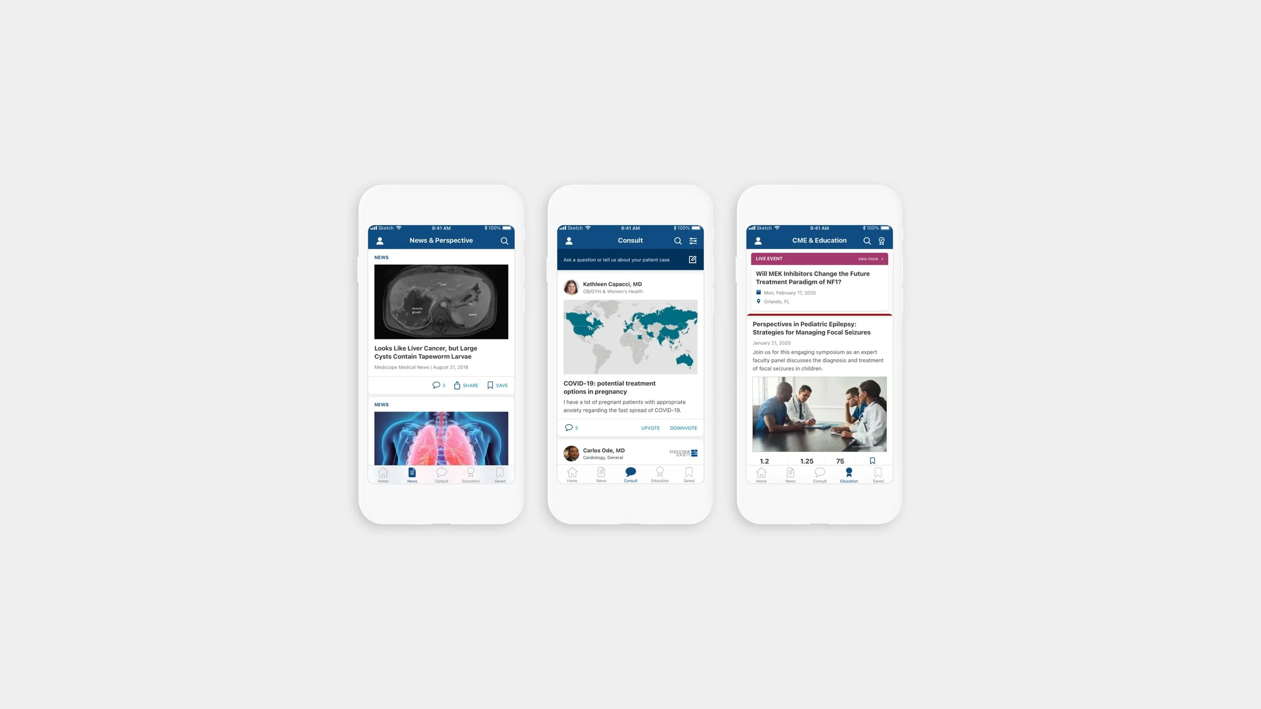
Make it easy for physicians to earn CME (continued medical education) credits
CME allows physicians to take free classes and gain credits by completing activities/tests. It is required for physicians in every state to do this in order to stay accredited. Making CME a native feature of the app allows the physicians to experience the streamlined flow that we offer in the stand-alone CME app. It also gives easy access for our users to check their credit, save CME activity for later and discover new credit opportunities.
The Results
Overall after launching the redesigned app we received very positive feedback on the simplified user flow and cohesive look and feel. Over one month we saw an uptake in the number of unique users (+2%), sessions (+53%), page views (+15%), and an increase in sign-up to the Consult tool. The creation of the design library and components also allowed for faster ideation sessions, testing, and implementation.